Print brief research and planning

It was to raise funds for starving children in Africa. It could be interesting because it represents the impact music has a an industry and a community globally.
The editing style is very humanistic cartoon/ art-ish like which was very prominent in the 80's so it accurately represents.
(This Is Pop is a documentary series exploring different influences and trends in pop music.)
Back story, dreams/ aspirations
Through different nostalgic conventions
A range of images like a collag
These two IMDb image links point to stills or frames from the same documentary series (This Is Pop.)


Compare the two different images from this series:
2) Billboard Poster Research (Era Focus)
You must research THREE professional billboard or large-format posters, one from each era:
1. 1980s or 1990s pop artist promotion


2. 2000s or 2010s pop artist promotion


3. Contemporary (2018–present) pop artist promotion


These may include:
- Tour posters
- Album or single promotions
- Music documentaries
- Streaming platform music content (e.g. Netflix, Apple TV)
Choose artists that are clearly representative of each era.
3) Media Language Analysis
For each billboard poster, analyse how visual design communicates meaning and appeals to its audience.
You should analyse:
Layout & composition
(scale, hierarchy, central image, simplicity for roadside viewing)
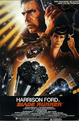
- The main singer is the biggest visual along with the band name 'Rolling stones'. This is what's meant to catch the eye. 'Film Concert' being the next biggest font and in the centre promotes the reason behind the billboard and advertisement.
- 'Specials' being the boldest verbal code as well as having the biggest typography it is simple advertising the feel of the new album as well as the band it self.
- Collage of various popular bands. No central image just shows wide range and representation, represents the popularity of music in the last 20th century.
- No central image, shows popularity scale of the early 21st century. Represents the rise in artists in this era
- Just the individual artist as the main image, the main advertisement/ product. In smaller writing below is the list of songs that are in the new album, promotes the album and the artist.
- Amy Winehouse as the largest/ main central image, title in bottom centre- shows the popularity of the artist and that song/ album, only needing a face to promote the film.
- Recent artist popularity, shows the genre change from the earlier decades to now.
- The artists are the largest image and cover most of the frame (middle and left) and are behind a crow silhouette. The title is to the right. We read from left to right so the artists are meant to catch our eyes first then the typography is meant to inform us after.
- Bruno as the main and centre image along with nothing else, despite now being part of a group - he is the catch. His name and tour at the top also alone represents his popularity and how he needs minimal advertisement to promote his tour and album.
Typography
(font style, size, era connotations, readability)
- Typical fancy font for the 80's also is identified specifically with that band.
- Bold and in a simple colour typically represents the 80's
- Fancy/ cursive bold typography even in the smaller writings, represents the 80's
- Bold simple serif writing shows the modern era
- Font is identified with the artist and the genre the artist performs in
- Simple modern font - very common
- Simple serif font to just rely artist names. 'Top artists' being the largest font to catch readers eye and inform purpose of the billboard
- Font is bold but varies slightly across the billboard, keeps the attention of the reader
- The font change for 'The Romantic Tour' represents the vib eof the album rather than the artist or the era.
Colour palette
(neon, muted, monochrome, saturation and era signifiers)
- Monochrome colour scheme
- Black and white
- Contrasting colours all over - represents the 80's era
- Same colour pallet as the billboard brand uses
- Pink and black represents the artist themselves and their individual brand
- Gold and black colour scheme represents the value the artist held when she was alive
- Identifiable colour scheme for the brand
- Blue and black for a dark and subtle back ground as well as symbolising the area and lighting that will occur. Gold being the brightest and behind the artists shows their value and and they are the main event.
- Grey and white for subtleness whilst the bold red contrasts it and catches viewers eyes immediately.
Imagery
(pose, gaze, styling, realism vs performance)
- Aggressive preformative pose- rock n roll
- Simple drawing/ shadow outline of a man
- Overwhelming amount of images
- Straight forward representation of artists
- Bland background and saluting pose from the artist- no performance.
- Very preformative with the mic prop
- Straightforward representation of artists
- Chaotic and filled with artists and people- represents how large the event will be
- Basic imagery, just the artist and his tour.
(logos, streaming platforms, consistency)
- Date and location of concert
- Record company of album
- No individual branding
- 'Billboard' in the top left corner, showing the brand and producer of the list
- Album name and artist name
- No logo, just movie name to promote the film
- 'Billboard in the top left corner, showing the brand/ producer of the list
- Hulu in Bold and it's main identifiable colour (green) which represent popularity of the brand
- Artist name is the branding
Then, explain how these choices reflect the era of pop music being represented.
4) Representation and Era identity
Explain how each poster represents:
The artist
- Font, costume and facial expression/ reaction is identifiable to the artist and genre
- The specials is calm and relaxing so their poster/ album cover matched their 'feel' and genre as well
- Reflects the genre
- Shows most popular artists at the time
- Represents their genre and audience attraction
- Represents the impact The artist had on their generation/ fan base
- Shows most popular artists of the time
- Promotes the artist's and creates a wider audience
- Shows the popularity of the artist among audiences
The music culture of the era
- Music with prominent instruments were loved
- Music with a distinct style (against postmodernism)
- Heavy instruments were loved
- popularity contest - music is apart of the culture now
- Promotion is very artist specific, to identify the subculture of the audience
- Music artists are always remembered for their great work
- Music is a popularity contest
- Music brings people together
- Music is global/ world wide - shows the postmodern era
Attitudes to fame, performance, and identity
- Identity is very distinct for artists in this era
- Promotion is very simplistic and straight forward - specific ot artists and no references
- Fame, identity and performance is very bold
- Fame is where artists get their identity
- Artist identity is strongly presented in the format and decisions of posters/ adverts.
- Fame is very high because of artist's performance and individualism/ uniqueness
- Fame and popularity is measured
- Performance is what captures the audience
- Artists going on tours have become an expectation in this era as well as 'fighting' for tickets to see artists perform
Consider:
Fashion and styling
Gender representation
Star image
Youth culture vs nostalgia
Authenticity vs commercialisation
Apply at least one theory, such as:
Stuart Hall – Representation
Postmodernism (nostalgia, pastiche, remixing eras)
For each era-based poster, explain:
Who the primary audience is
- Alternative and/or rock n roll lovers
- Jazz lovers, elder people - because it is calm and simple just like jazz
- Hard/ aggressive music people. Older generation
- Millennial/ explorers & aspirers: to stay up to date
- Punk rock lovers, younger generation: That's the genre of this artist, younger generation is more accepting of alternative lifestyles
- Whoever is a fan of Amy winehouse and music lovers of her generation: she was popular in a specific era.
- Younger generation, explorers and aspirers and mainstream audiences
- People deep into music culture - explorers as well
- Bruno Mars fans, as well as Leon thomas fans etc
How it may also appeal to other age groups
- Bold and eye catching- gets the attention of younger generations
- Boring and unappealing to younger generations - nothing to it
- Overwhelming, too much going on
- Older generation may find it pointless as there is no direct promotion of each artist
- Older generation may find it inappropriate - because the subversion of masculine stereotypes
- May appeal to all generations - because of artist age, era and genre of music
- Older generation may find it pointless as there is no direct promotion of each artist
- Appeals to multiple generations as it is an event that promotes 50 years of music
- Appeals to a younger generation because of the era each promoted artist 'peaked' in.
How nostalgia is used to attract older audiences
- Shows the era the artists were greatest in
- Album with meaningful lyrics and representation
- Wide representation of popular bands and music in the era
- Older artists are still relevant and popular today
- N/A
- Goes through her life also giving representation of the era
- N/A
- Shows music performers of songs in the past 50 years which is a wide range
- N/A
How modern design elements attract younger audiences
- N/A
- N/A
- N/A
- Bold vibrant colours - eye catching
- Unconventional font - eye catching
- Eye catching make up and bold background
- Bold and eye catching colours as well as layout
- Bold and dramatic design and representation of multiple genres
- Popular music artist of younger generation.
Link this directly to the documentary’s aim to appeal to “people of all ages interested in pop music.”
6) Streaming services and industry conventions
Research how streaming services (e.g. Netflix) promote music documentaries.
Analyse:
Common visual conventions (minimal text, strong imagery)
- Not wordy, straight forward
- Not wordy at all and straight forward
- Bold titles, bold contrasting colours
- Bold title
- Unconventional fonts, main/ strong imagery
- Strong/ bold main title
- Bold title
- Strong imagery
- Bold title
Use of logos and release dates
- Just under the event name
- Announcing where the album is available
- N/A
- Logo to make it known it is an official list
- Promoting record label
- N/A
- Logo to make it know it is an official list
- Announcing where the fair will be available to watch
- No streaming services mentioned
How platforms communicate where and how to watch
- N/a
- Verbal codes - bold writing
- N/A
- N/A
- Date and location
- N/A
- N/A
- Typography
- Typography
How global audiences affect design choices
- n/a
- n/a
- Different language
- Global artists being promoted
- Global tours
- Digital convergence
- Global artists being promoted
- Digital convergence
- Global tours
You may refer to:
Netflix documentary posters
Online promotional materials
Billboard adaptations of streaming campaigns
This section must directly link your research to your final production.
Answer the following:
How will each era influence the design of your three billboards?
What visual codes will you use to differentiate eras?
How will you maintain brand consistency across all three posters?
How will you promote your band from Task One as contemporary pop?
What design skills do you need to develop before production?
Planning and sketching
1) Plan the content for your first billboard poster:
- Title of the documentary film (must be NEW original mainstream music magazine you have invented):
- Name of streaming service the documentary will feature on
- Original image (the band you promoted for one of your TikTok music videos)
- Release date of the documentary
- Ways your billboard poster will represent the contemporary pop era
- Font will be identifiable with band
- Costumes of the band members
- Colour scheme of the billboard
- Font style / colour scheme, additional design aspects:
- 90s:
- 2010s:
- Now:
- 90s: Warm deep colours
- 2010's: Pink, red, blue, black, white, green - all bright and bold
- Now: White or black background
2) Plan the three images you will use for the billboard posters - use the elements of mise-en-scene (CLAMPS). One image has to be the band you promoted in one of your TikTok music videos required to meet the minimum content in the brief.
3) Research and select the font or typography you will use for your billboard posters. This is a critical element of your print work - the brief requires a consistent house style running through all of your pages.
4) Produce A4 sketches of your billboard poster designs and scan it/upload a picture to your blog.

5) Finally, create the pages in Adobe Photoshop or InDesign so you have the documents ready to go in terms of adding your text and images. This will need to include:
- A3 landscape
Photoshoot
1) Who do you need to photograph for your billboard posters? Remember, you need three original images across the whole print production.
2) What camera shots do you need? Write a shot list or draw a storyboard for your photo shoots. Make sure you plan a variety of camera shots you will look to capture - medium shots, close-ups etc.
- 90's:
- 2010's:
- Contemporary/ Now:
Statement of Intent
1) Once you have completed your print research and planning, go back to your statement of intent and make sure you have included the print brief in your final draft. Then, submit the final draft statement of intent to your teacher. The due date for this will be confirmed by your coursework teacher.
Use your Media coursework lessons to complete these planning tasks - homework time should be exclusively to revise for mocks.

Comments
Post a Comment